CAPITAL ONE
Reimagining Product Upgrades
How a mobile-first redesign reduced friction, increased conversion, and helped customers make more confident financial decisions.
The Product Upgrades experience helps Capital One customers move to credit cards that better align with their financial needs and goals. While the program represented a significant business opportunity, the mobile experience was creating friction at a critical decision point in the customer journey.
Despite 84% of customers accessing the experience on mobile devices, the journey relied on a slow webview embedded within the Capital One app. Customers experienced long load times, limited comparison capabilities, and an experience that often felt disconnected from the rest of the product.
As the design lead and sole UX/UI designer, I partnered with product and engineering to transform the experience into a native mobile journey that reduced friction, improved decision-making, and established a scalable foundation for future offer experiences.
Role: Design Lead & Sole UX/UI Designer
Platform: Native iOS & Android
Team: Product, Engineering (iOS, Android), Platform Teams
Results
+7.5% increase in conversion rate
+14% increase in feature completion
Load times reduced from ~6 seconds to 1–2 seconds
$9.3M projected annual value
Reusable carousel component adopted into Capital One's design ecosystem
The Opportunity
The existing mobile experience relied on a webview within a modal—leading to:
~6 second load times
~40% customer drop-off in the upgrade funnel
No way to compare new cards to current ones—a key barrier to decision-making
Given that mobile drives the vast majority of upgrade traffic, the need for a reimagined native experience was clear.
Research & Discovery
I began by reviewing prior research on the card shopping journey and supplementing it with:
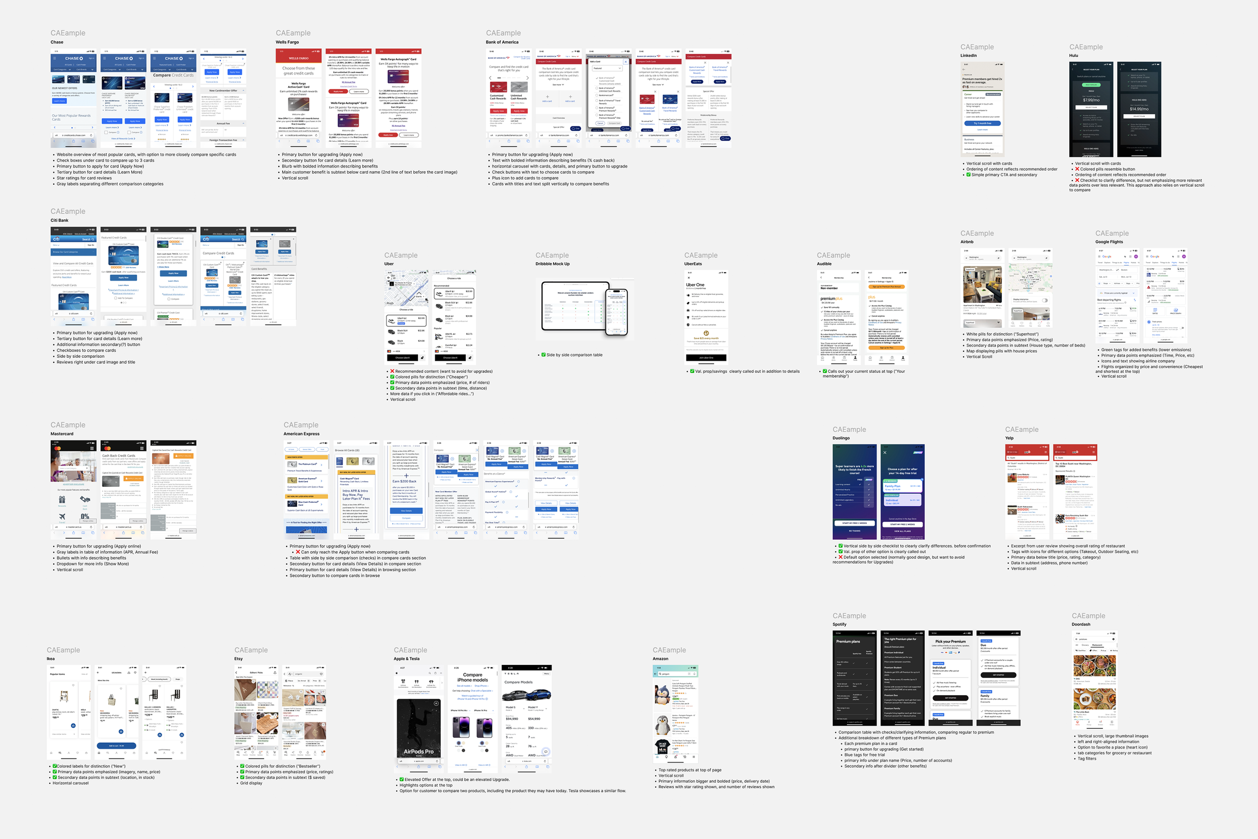
A competitive audit of 26+ experiences across banking, retail, e-commerce, and fintech
Two rounds of qualitative usability testing on early concepts and final designs
Key Insights:
Most drop-offs occur during exploring and considering stages
Customers weren't struggling to browse cards. They were struggling to make a decision.
Primary motivators: cash back, no annual fee, and increased rewards
Key barriers: impact to credit score, unclear benefits, and process uncertainty
Customer Problem
Confusion and frustration due to slow load times—users often assumed the experience was broken
Lack of comparison tools made it hard to understand upgrade benefits
Lack of transparency around fees, credit score impacts, and timeline for card delivery
Competitive Analysis Highlights
Banking competitors offer side-by-side comparisons, horizontal carousels, or accordion views
E-commerce standards emphasize scannability with rating pills, card sorting, and image-forward layouts
Inspiration from outside the industry helped introduce new interaction models to reduce cognitive load
Defining a Better Decision-Making Experience
Discovery & Ideation
Synthesized insights into feature requirements
Created three distinct concepts to test layout and comparison flows
Explored solutions that balance card browsing with decision-making tools
Usability Testing (2 Rounds)
Round 1: Concept testing with 3 prototypes
Concepts aligned with user expectations, with 83% saying they would use the experience again.
Rewards and annual fees were the most important factors when evaluating upgrade options.
Horizontal carousel had the most positive feedback—reduced cognitive load of selecting cards
Many users wanted more comparison options like a grid, side-by-side view or chart to compare multiple offers

Round 2: Testing refined carousel + additional comparison modes
All participants were able to scroll horizontally to compare card options with ease.
When more than five cards were present, participants preferred an alternative comparison method; 63% specifically suggested a chart view for card details.
The horizontal carousel was validated as the preferred browsing option.
Card layouts should present snippets in a consistent order across all cards to improve scannability.

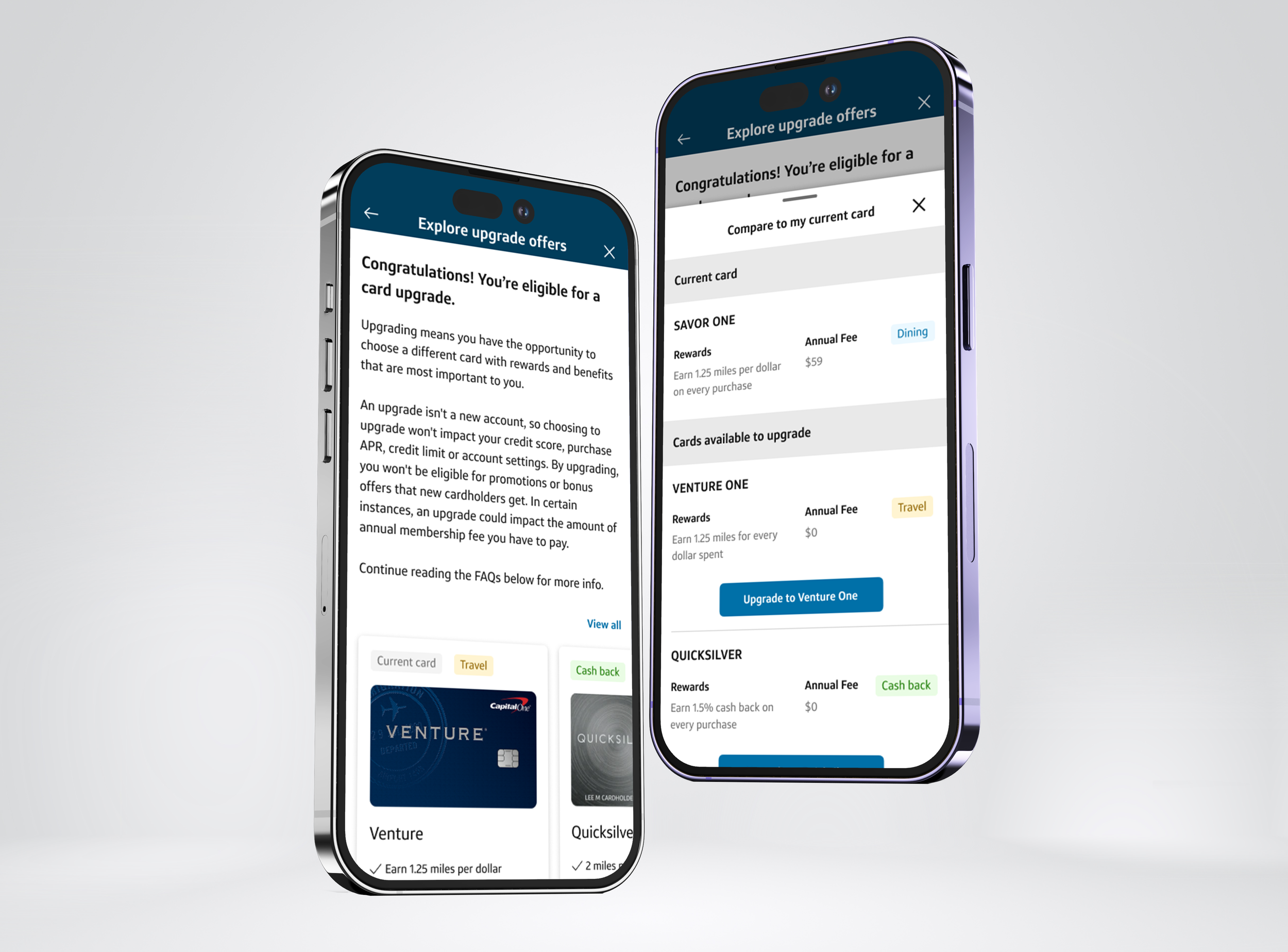
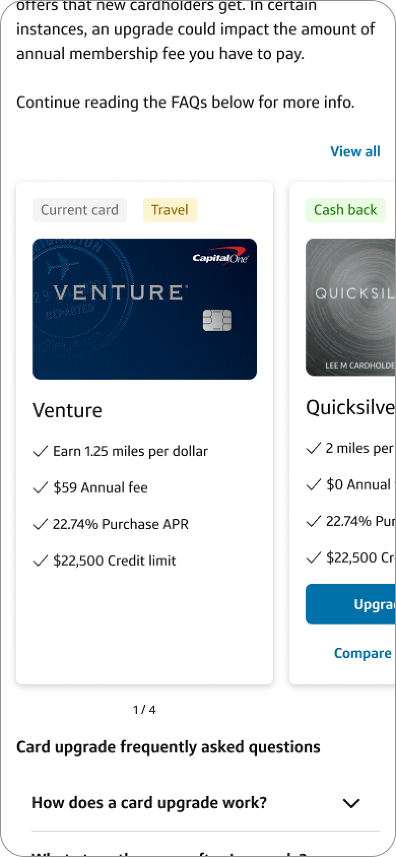
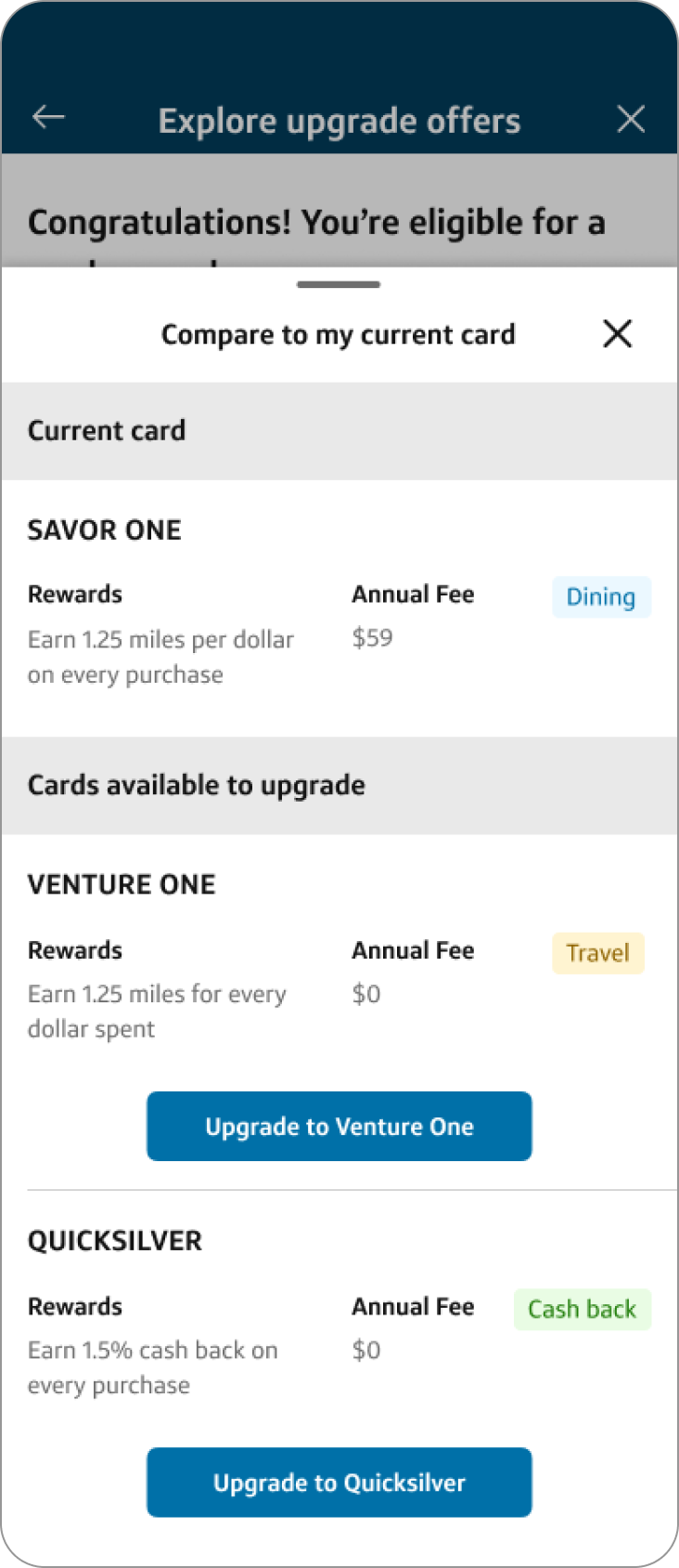
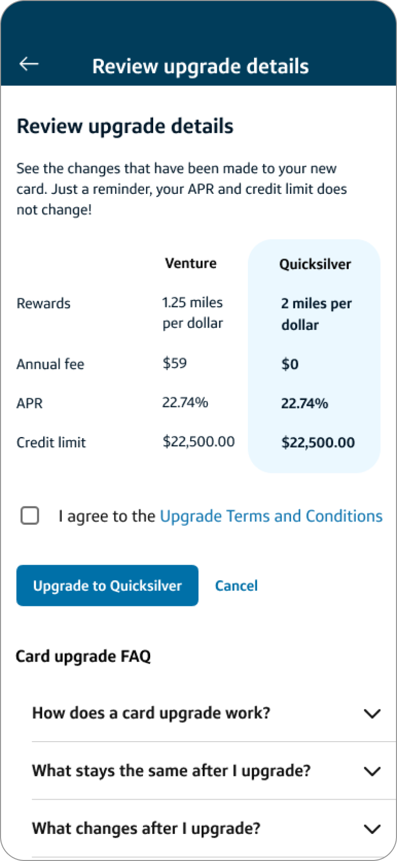
Final MVP Design Solution
Final MVP featured a horizontally scrollable card carousel with key card details
Introduced a comparison modal to support deeper decision-making
Built with native performance standards to significantly reduce load time
Developed using custom UI components, since platform constraints required new, reusable building blocks


Challenges & Collaboration
Accessibility: Ensured clear indicators and swiping behavior for the carousel; explored alternatives for broader usability
Platform Constraints: Worked around front-end limitations by partnering with comparison platform teams to align on reusable, scalable components
Design Systems: Collaborated with internal design systems teams to contribute components that could benefit other product surfaces across the app
Impact
MVP launched to 50% of mobile users (iOS & Android)
Conversion rates increased by 7.5% after one month
Load times improved from ~6 seconds to 1–2 seconds
14% increase in feature completion rates
Projected $9.3M in annual NPV at full scale
Designed and introduced a reusable carousel component that was adopted into Capital One's design library and front-end platform, extending impact beyond the Product Upgrades experience and enabling future offer experiences across the ecosystem.
Key Takeaways
This project reinforced an important lesson: helping customers make financial decisions isn't just about surfacing information—it's about reducing uncertainty. By focusing on confidence, comparison, and clarity, we were able to improve both customer outcomes and business performance.
Final Thoughts
Reimagining the Product Upgrades experience wasn’t just about improving a feature—it was about creating a mobile first product experience that respects users’ time, reduces anxiety, and builds confidence in their financial decisions.
This redesign not only elevated the customer experience but also laid the groundwork for a more cohesive carousel offer experiences within Capital One.